
Design in Modern Resumes - The Art of First Impressions
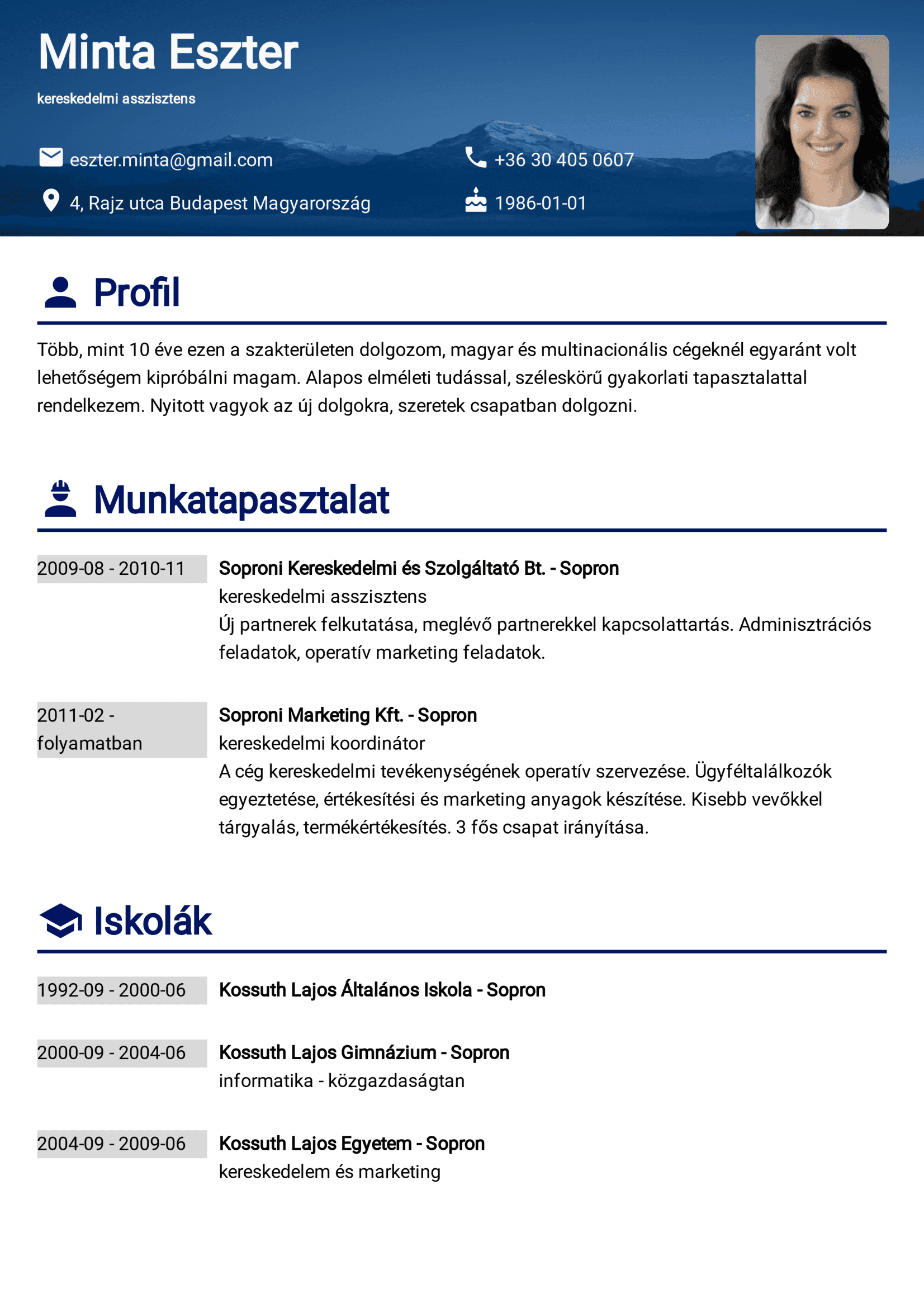
In today's competitive job market, a resume is more than just a summary of your work history – it is a personal billboard, a unique canvas where your professional story is sketched. A resume must be tailored not just in content but in design to reflect an individual's unique professional identity. The design elements – from color schemes and typography to layout and visual hierarchy – work in unison to create a compelling story. They can grab attention, make a statement, and, most importantly, leave a lasting impression on potential employers.
Why is design important?
In today's job market, which is more competitive than ever, your resume design plays a crucial role. Because of how fast-paced our world is, recruiters are overwhelmed with a huge number of job applications, which means they often have just a few seconds to look at each CV. You only have one chance to grab the attention in such a short time.
Creating the first impression
Every component must work together seamlessly in the brief moments a recruiter looks at your CV. The stakes are high: if your CV fails to capture attention in those first few seconds, your application risks being overlooked. Thus, it's not just about possessing good information; how you present it is equally critical.
Design elements like color schemes and typography are crucial in creating a solid first impression. They should draw the recruiter's attention and guide it towards the most important parts of your resume. A well-designed CV does more than catch the eye; it ensures that your key skills and achievements are immediately noticeable, keeping the recruiter's interest focused on what you bring to the table.
Increasing readability
The design of a CV significantly aids in clarifying information and boosting its readability. A well-thought-out layout and spacing ensure crucial details are easily noticeable and understandable. Clear headings, bullet points, and distinct sections facilitate a smooth flow of information, showcasing your experience and skills effectively. Typography is crucial; the right font and size enhance legibility, making the CV comfortable to read.
Furthermore, an appropriate color scheme can highlight important areas without overwhelming the reader, effectively drawing attention to crucial information. Visual elements like icons or subtle lines can also break the monotony of text, making your professional journey engaging and easy to follow. These design choices work together to increase your CV's readability and create a visually appealing narrative of your career, making your application memorable.
Highlighting important information
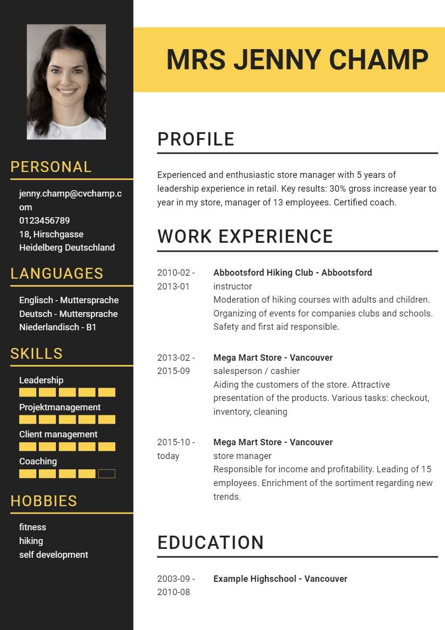
The design of a CV is essential not just for making a solid first impression but also for ensuring that recruiters can easily find the information they're looking for, such as key competencies or specific keywords. You can make these crucial details stand out by employing design elements like bold fonts or color highlights. For example, using a distinct color or font style for significant achievements or skill sets instantly draws attention to them.
Incorporating bullet points or graphic elements can effectively spotlight quantifiable accomplishments or specialized skills. This approach does more than just enhance visual appeal; it strategically positions important keywords and competencies, making them readily identifiable. This not only maintains the recruiter's attention but also aligns your CV closely with what they are searching for, thereby increasing the effectiveness of your application.
Showing professionalism
Showing professionalism through the design of a CV involves a careful balance of aesthetics and functionality. A professional-looking CV typically features a clean, uncluttered layout, demonstrating organization and clarity of thought. Choosing a simple yet elegant color scheme conveys a sense of sophistication and seriousness. Avoid overly bright or numerous colors, as these can distract from the professional tone.
Typography is another critical aspect. Selecting a readable, professional font and maintaining a consistent font size and style throughout the document adds to the professional feel. Consistency in headings, bullet points, and alignment shows attention to detail, a trait highly valued in any professional setting.
Key elements of resume design
Understanding the critical elements of resume design is crucial. A well-designed resume balances typography, color schemes, and layout to present information clearly and engagingly. We will explore these fundamental design aspects, setting the stage for a deeper dive into how they can be effectively utilized to enhance your resume's impact and readability.
Layout
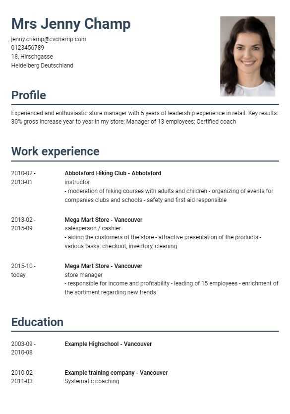
The layout of a resume is a critical element that significantly influences its effectiveness and impact. A well-structured layout helps organize the content in a way that the recruiter can navigate, ensuring that critical information is readily accessible. The importance of a good layout lies in its ability to present your professional story coherently and clearly. It's not just about listing your experiences and skills; it's about showcasing them most effectively.
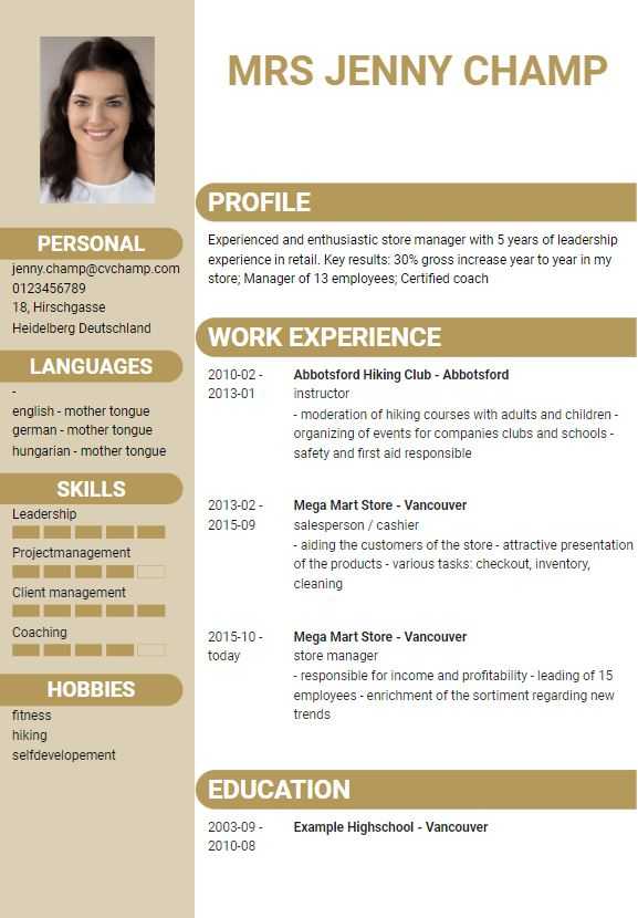
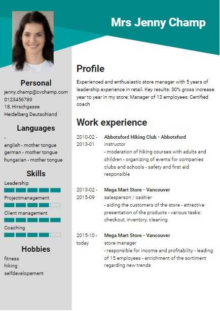
A thoughtful layout considers headings, bullet points, and spacing, which guide the reader's eye through the document. For instance, clear section headings make it easier to distinguish between different parts of your resume, such as work experience, education, and skills. Bullet points can concisely present achievements and responsibilities, making them more digestible than long paragraphs.
Furthermore, the proper layout can accommodate more information without cluttering the resume. It uses white space effectively to balance text and empty areas, enhancing overall readability. This arrangement ensures that the recruiter is drawn to the most important aspects of your profile, such as your most recent job experience or specific skills relevant to the job you're applying for. In summary, the layout of your resume is a foundational design element that affects its aesthetic appeal and plays a vital role in effectively communicating your professional narrative.
Typography
Typography is key in resume design, greatly influencing its readability and professional look. Selecting a suitable font, like Arial or Calibri, ensures readability and a polished appearance. The font size is equally crucial, which should balance being legible and professional. It's important not to use too many fonts or font styles, as this can make the resume hard to read and appear disorganized. Consistency in typography, using a single font style throughout, creates a cohesive and smooth flow, guiding the reader effortlessly. Strategic font weights or styles can highlight important sections, drawing attention without overwhelming the overall design. Effective typography is vital for a clear, impactful resume that captures attention for the right reasons.
Color scheme
Choosing the right colors can transfer a sense of your personality and professionalism, making your CV stand out in a pile of monochrome documents. Colors have the power to attract attention and wake emotions, which can be beneficial in creating a memorable resume.
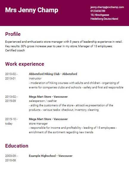
However, it's crucial to use colors sparingly. A minimal and subtle color palette is often more effective than a broad spectrum of bright hues, which can be distracting and appear unprofessional. For example, using a single color for headings or key details can create a visually pleasing contrast against a clean, white background. This adds a touch of personality and helps organize the content, making it easier to scan and locate important information.
The choice of color should also reflect the industry you're applying to. Conservative fields like finance or law might prefer more calm colors, while creative industries could welcome more vibrant schemes. Overall, a well-chosen color scheme enhances the readability and attractiveness of your CV, playing a crucial role in creating a positive first impression.
Visual elements
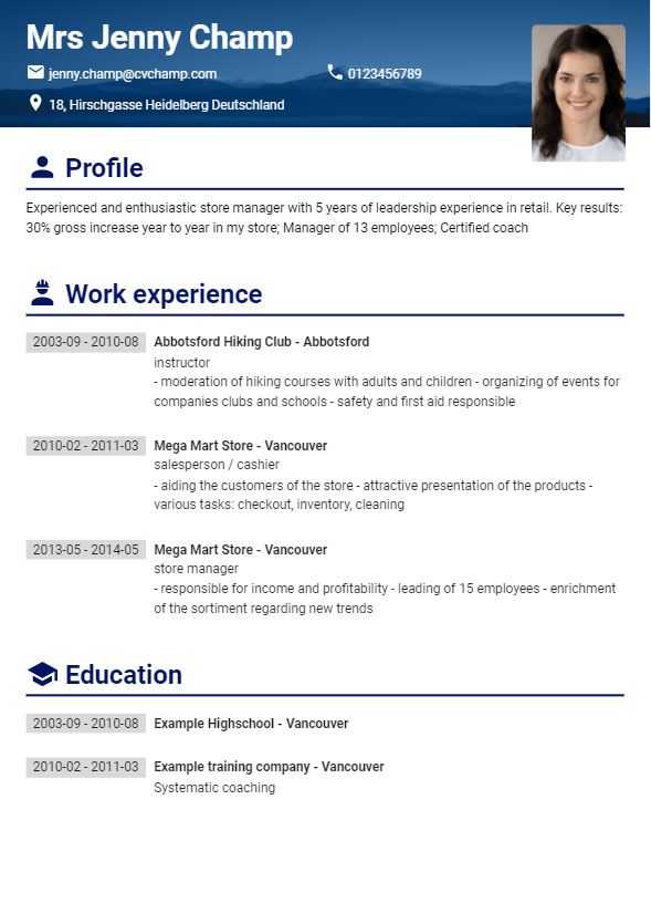
When used effectively, other visual and graphic elements in a resume can significantly enhance its overall impact and readability. Elements like icons, charts, and infographics can add a dynamic layer to the presentation of your information. For example, icons can be used to symbolize contact details or skills, making them immediately recognizable and adding a modern touch. Charts and infographics are handy for visually representing data, such as proficiency in skills or achievements in quantifiable terms.
These graphic elements serve as aesthetic enhancements and tools to make your resume more engaging and easier to read. They break up long stretches of text, making the document less daunting and more inviting to read. Additionally, they can help visually summarize complex information, enabling recruiters to grasp your skills and achievements at a glance.
However, it's essential to use these elements sparingly and strategically. Overuse or inappropriate use can clutter the resume or distract from the crucial content. The key is to integrate them in a way that complements and emphasizes your qualifications without overwhelming the overall design. Incorporating visual and graphic elements can make your resume more memorable and effectively convey your professional story.
Balancing Creativity and Professionalism
This balance is vital to crafting a CV that is both unique and appropriate for the job market. On one hand, creativity allows your resume to stand out. It can be expressed through innovative layouts, subtle use of color, or the inclusion of graphic elements that reflect your brand. These creative touches can make your resume memorable and showcase your individuality.
On the other hand, maintaining a professional tone is essential. No matter how creative your resume is, it must still adhere to clarity, legibility, and organization standards. This means avoiding overly elaborate designs that might overshadow the content or make the resume easier to read. The information should be presented straightforwardly, ensuring that your skills and experiences are the focal points.
Striking this balance involves understanding your industry's norms and potential employers' expectations. For instance, creative fields may allow for more design freedom, while traditional sectors might favor a more conservative approach. The key is to inject creativity in a way that enhances, rather than detracts from, the professional presentation of your qualifications. Balancing creativity with professionalism in your resume design ensures that it captures attention and conveys your suitability for the role clearly and effectively.
Advantages of resume templates
Using resume templates offers several advantages, particularly for those seeking efficiency and guidance in structuring their resume. Templates provide a pre-formatted layout, which can be a significant time-saver. They eliminate the need to start from scratch, ensuring that all the essential sections are included and properly arranged. This can be especially helpful for job seekers who are unsure about resume formatting or those who are new to the job market.
Templates also offer a professional layout that adheres to industry standards, which can be reassuring for those worried about meeting the expectations of potential employers. They ensure that your resume has a clean, organized look, crucial for making a positive impression.
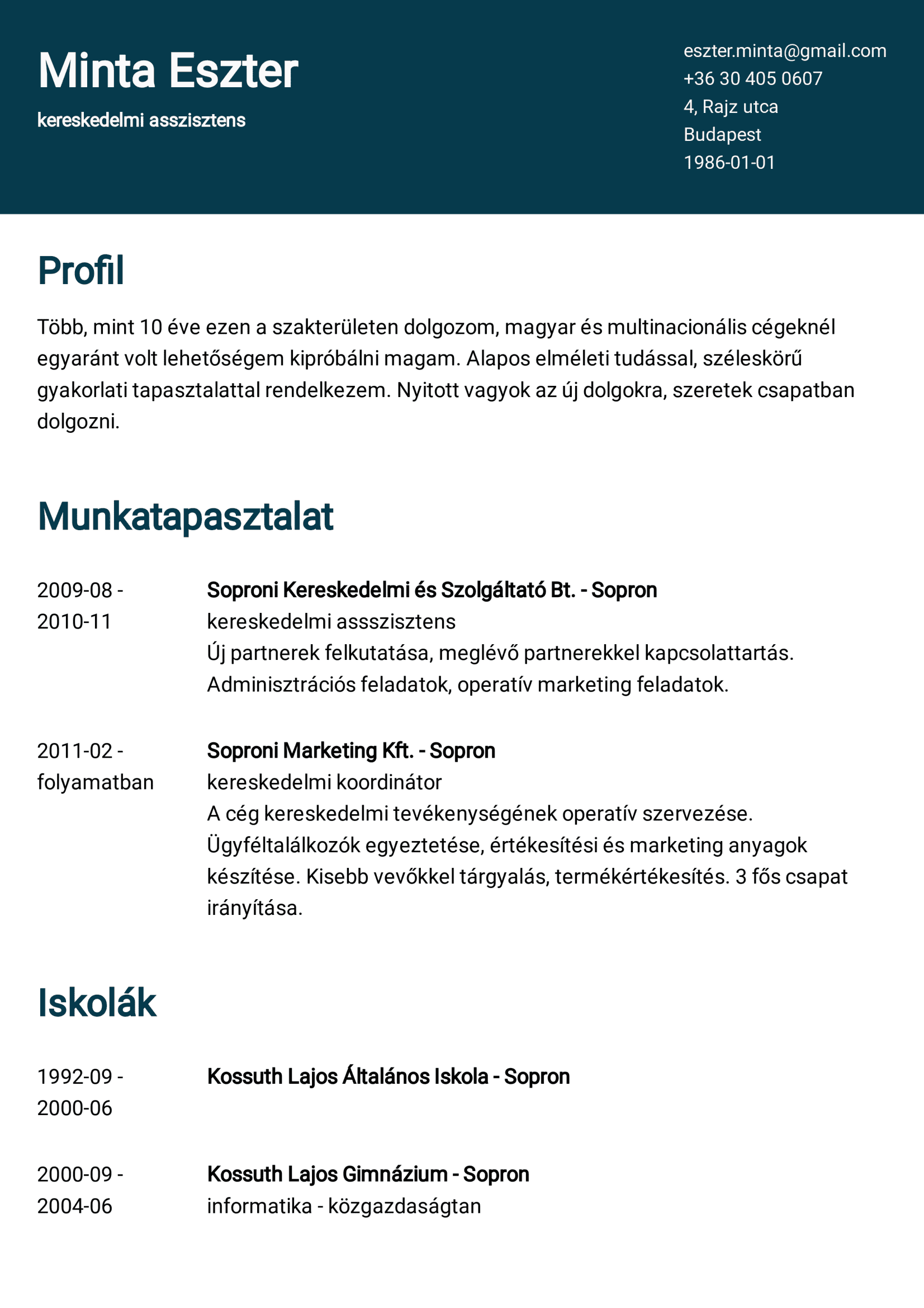
However, a common concern with templates is the risk of ending up with a resume that looks like many others, potentially losing its uniqueness. This is where customization plays a crucial role. While the template provides the basic structure, you can personalize it in numerous ways. This includes changing the color scheme to reflect your brand, adjusting font styles and sizes for better readability and distinctiveness, and rearranging or adding sections to highlight your unique experiences and skills.
Additionally, you can infuse your individuality through the content, using the template as a canvas for your professional story. Customizing bullet points, adding specific achievements, and using language that reflects your personality can all help make your resume stand out, even when using a typical template.
In summary, resume templates are advantageous for their efficiency and professional layout. Concerns about uniqueness can be addressed through thoughtful customization, ensuring that your resume reflects your individuality and professionalism.


